
Appearance
Email Templates
Email Templates allow an organization to create and manage branded email communications sent to customers at key points in the assessment workflow. Templates are built using a drag-and-drop editor and support dynamic merge tags that automatically populate customer-specific information when an email is sent.
In the navigation panel on the left-hand side of the screen, click on the Templates menu - select Email Templates -
The user will be brought to a view showing a list of Active email templates currently configured in the system.
The other tab in this view is the Archived tab which shows the archived templates, just click "Restore" to activate, allowing users to reference this template in the system.
Use the search box and Type filter at the top of the list to find templates quickly.
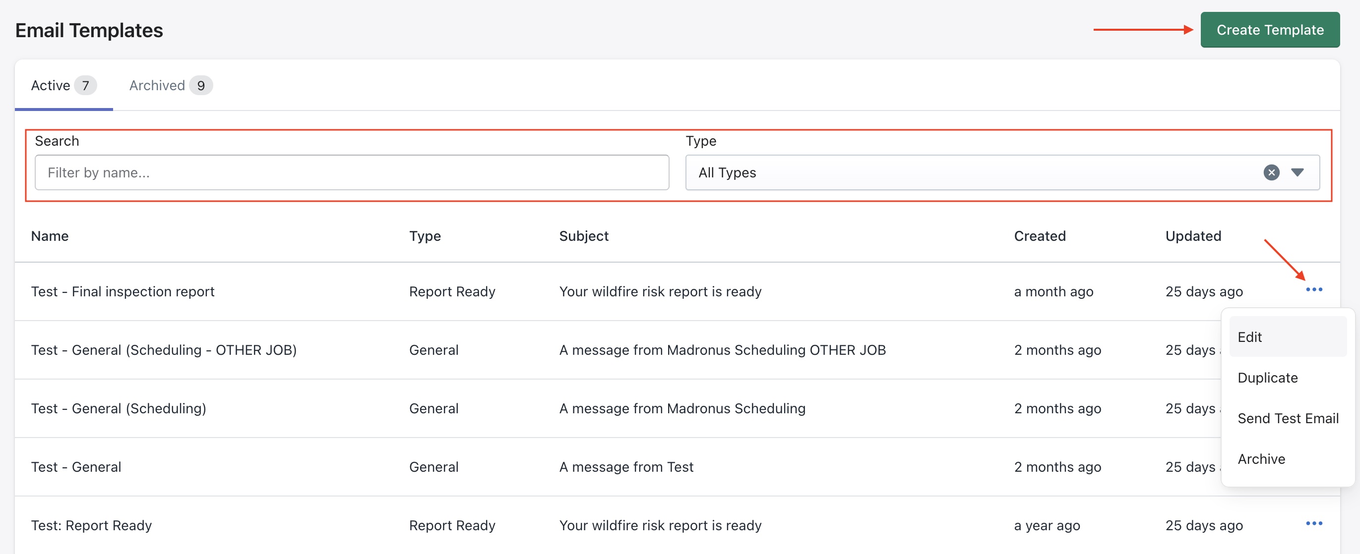
Click on the ellipses icon to access options to
- Edit to modify
- Duplicate to create a copy of an existing report template
- Send Test Email to enter an email address to send a test version of this template
- Archive to deactivate a template from the system
When to use the Duplicate feature
If an existing template can be used as a starting point, use Duplicate to copy and modify it as needed.
Creating a new template
Click the Create Template button to configure a new email template.
An example template is shown below.
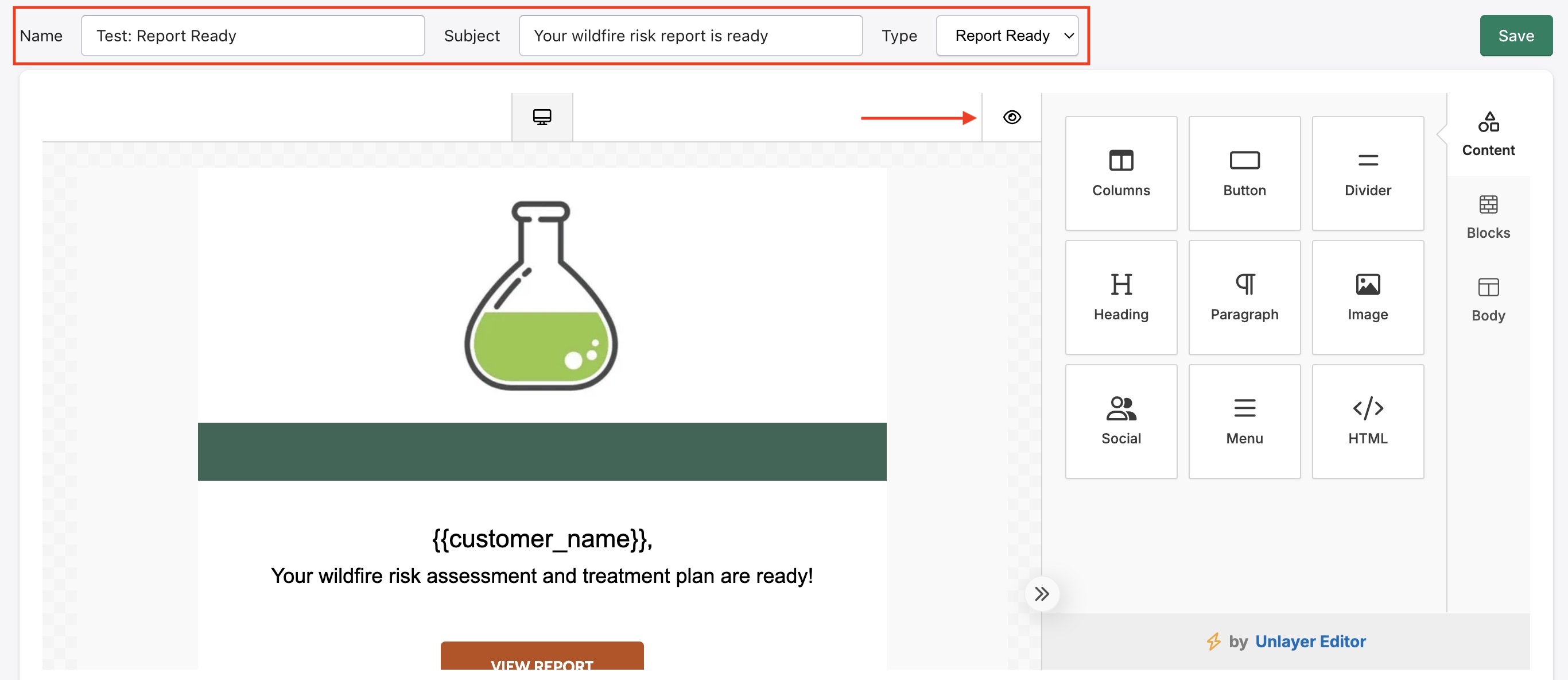
Template Editor - The editor provides a visual drag-and-drop interface for building email layouts. Click Save in the top right to save your changes at any time.
At the top of the editor, configure the template's core settings:
| Field | Description |
|---|---|
| Name | Internal name used to identify the template in the list |
| Subject | The email subject line recipients will see in their inbox |
| Type | The category of email e.g. General, Report Ready which determines when the template is used |
Use the Eye icon shown above to switch to preview mode.
Content Blocks
The right panel contains draggable content blocks that can be added to the email canvas:
| Block | Description |
|---|---|
| Columns | Adds a multi-column layout section |
| Button | Adds a clickable call-to-action button |
| Divider | Adds a horizontal line to separate sections |
| Heading | Adds a styled heading text block |
| Paragraph | Adds a body text block |
| Image | Adds an image block |
| Social | Adds social media icon links |
| Menu | Adds a navigation menu row |
| HTML | Adds a raw HTML block for custom code |
Drag any block from the panel (right) onto the canvas (left) to add it to the email layout.
Editing Content Blocks
Click any block on the canvas to select it and open its settings in the right panel. Each selected block shows delete (🗑) and duplicate (⧉) icons for quick actions.
Lets take a look at some of the content blocks with an example.
Image Block
When an image block is selected, some of the options available are shown below -
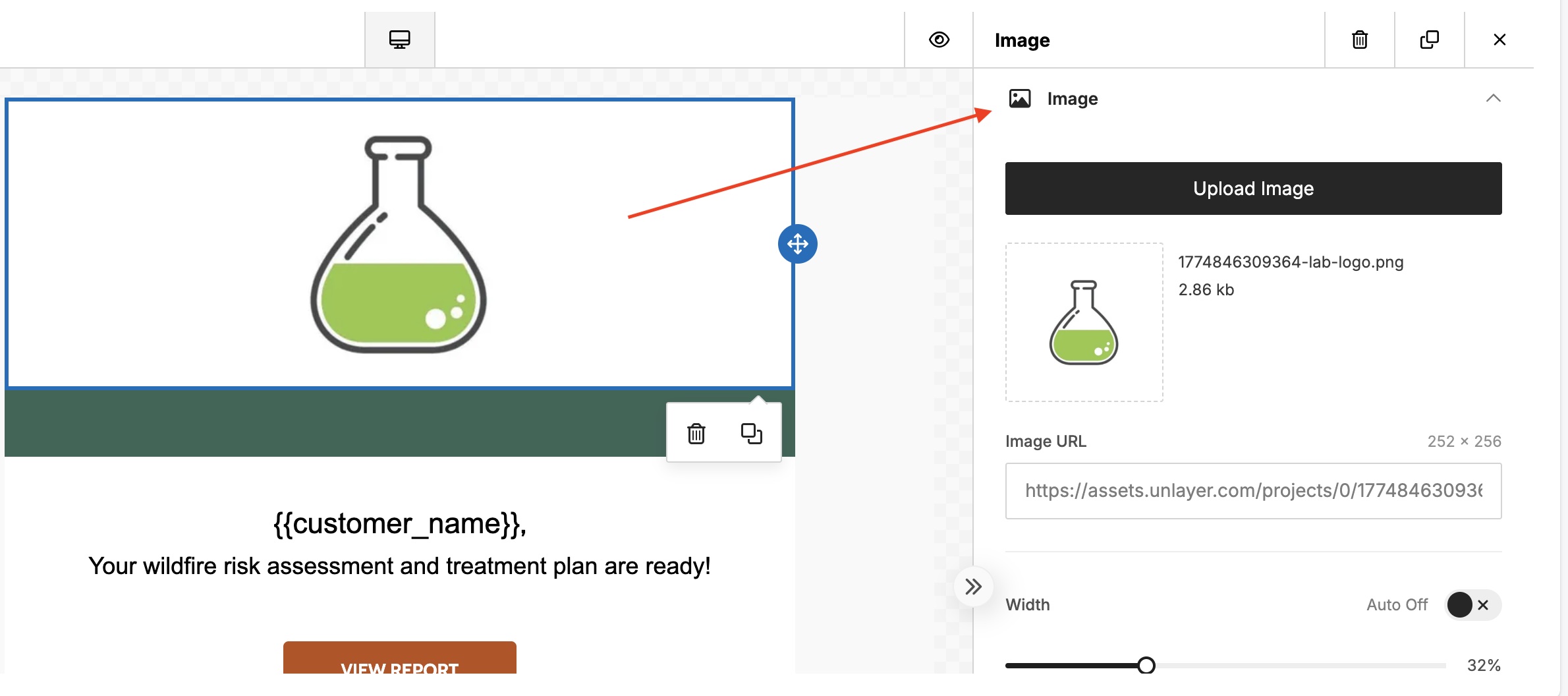
- Upload Image — upload a new image file
- Image URL — the hosted URL of the current image
- Width — toggle Auto width on/off, or manually set a percentage width using the slider
Text Block
An example text block is shown below -
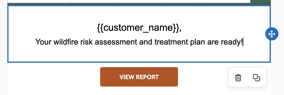
When it is selected, here are some of the options available to configure it.
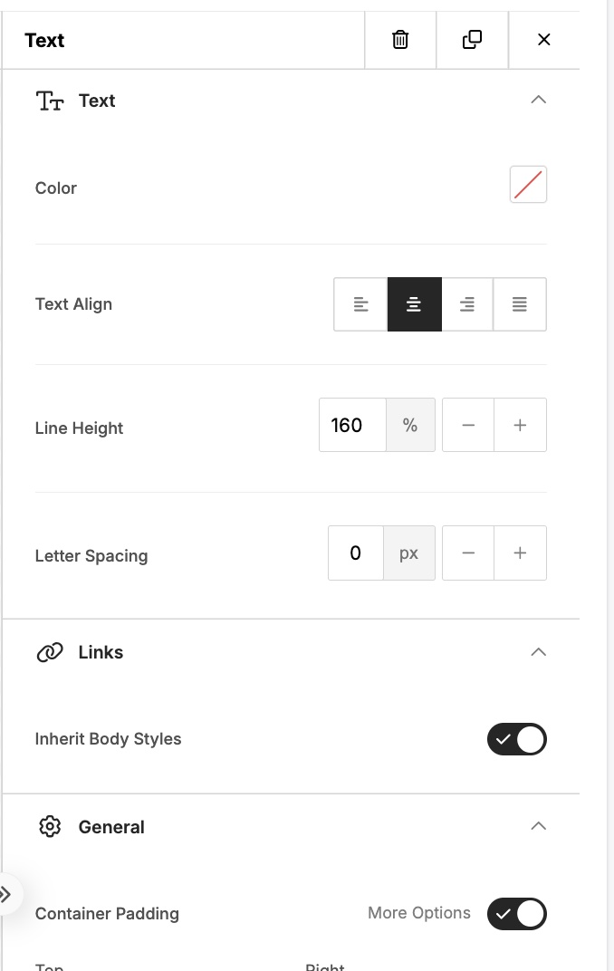
Text
- Color — sets the text color
- Text Align — left, center, right, or justify
- Line Height — controls the spacing between lines (default 160%)
- Letter Spacing — adjusts spacing between characters in pixels
Links
- Inherit Body Styles — when enabled, links will match the body text styling of the email
General
- Container Padding — controls the spacing around the text block, with a More Options toggle for individual side control
Button Block
When a button block is selected, the right panel shows:
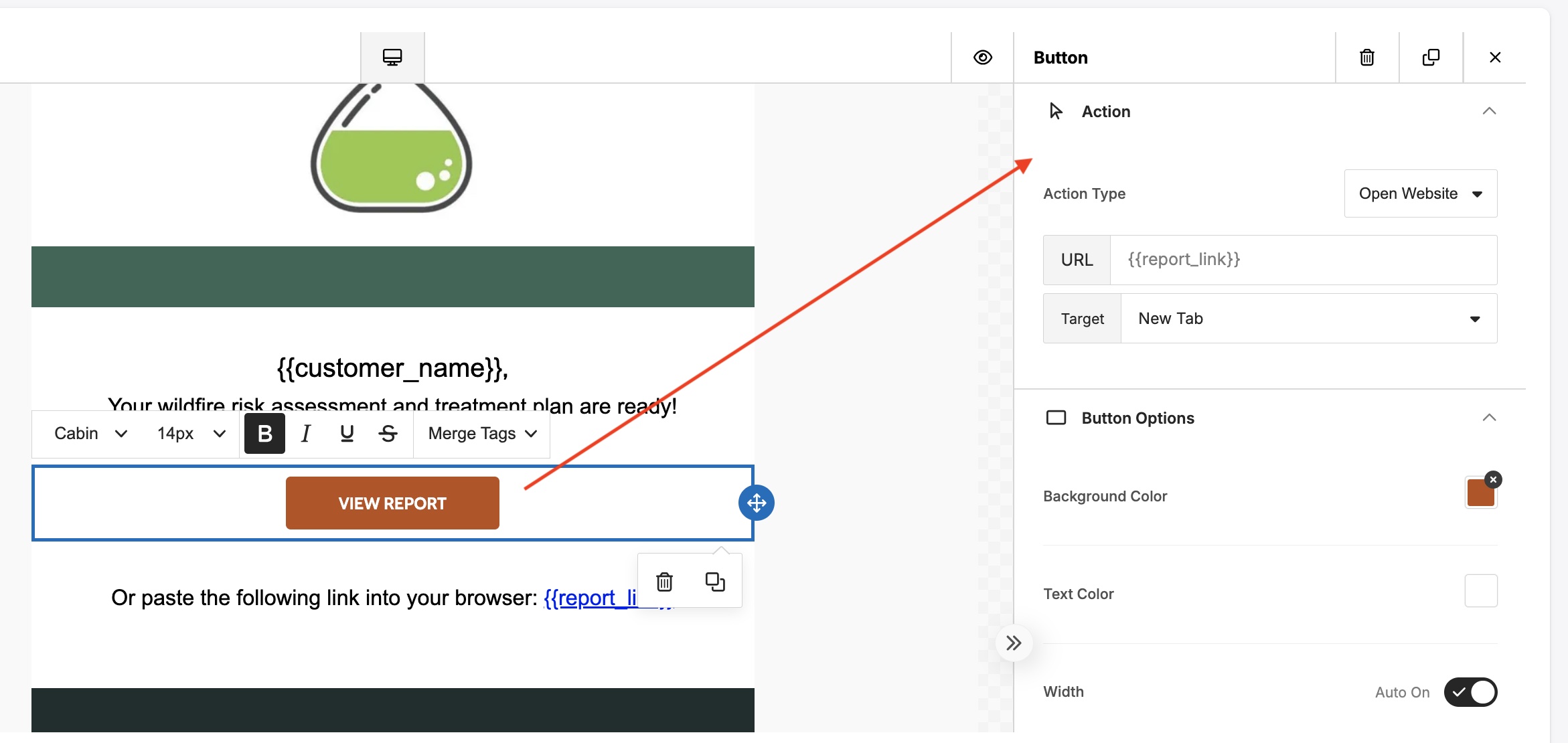
Action
- Action Type — defines what happens when the button is clicked (e.g. Open Website)
- URL — the destination URL. Supports merge tags such as "report_link" to dynamically insert the correct link per recipient
- Target — sets whether the link opens in the same tab or a new tab
Button Options
- Background Color — sets the button fill color
- Text Color — sets the button label color
- Width — toggle Auto width on/off
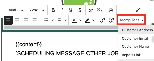
Merge Tags
Merge tags are placeholders that are automatically replaced with real customer data when the email is sent. They follow the format {{customer_name}}.
| Merge Tag | Description |
|---|---|
| {{customer_name}} | The recipient's name |
| {{customer_address}} | The recipient's address |
| {{customer_email}} | The recipient's email address |
| {{report_link}} | A direct link to the customer's wildfire risk report |
Merge tags can be inserted into text blocks using the Merge Tags dropdown in the text formatting toolbar, or typed directly into any text or URL field.
Notes
- Use Send Test Email before activating a template to verify formatting and merge tag behavior.
- Templates of type Report Ready are used to notify customers when their assessment report is available.
- Templates of type General are used for scheduling and other communications.
- Always click Save before leaving the editor.